Monday, June 22, 2020

How to use form builders in Angular 8 to validate reactive forms

Forms controls and form groups in Angular

Form controls are basically classes that can hold both the data values and the validation information of any form element, which means to say every form input you have in a reactive form should be bound by a form control. They are the basic units that make up reactive forms.

Form groups are constructs that basically wrap a collection of form controls. Just as the control gives you access to the state of an element, the group gives the same access, but to the state of the wrapped controls. Every single form control in the form group is identified by name when initializing.

Generating form controls

Setting up form controls, especially for very long forms, can quickly become both monotonous and stressful. Angular provides a helper service to solve this problem so that you can always obey the DRY concept of avoiding repetition. This service is called the form builder service.

Before we start…

To be able to follow through this article’s demonstration, you should have:

  • Node version 11.0 installed on your machine
  • Node Package Manager version 6.7 (usually ships with the Node installation)
  • Angular CLI version 8.0
  • The latest version of Angular (version 8)
    // run the command in a terminal
    ng version

    Confirm that you are using version 8, and update to 8 if you are not.

  • Download this tutorial’s starter project here to follow through the demonstrations.
  • Unzip the project and initialize the Node modules in your terminal with this command:
    npm install

Other things that would be nice to have are:

  • A working knowledge of the Angular framework at a beginner level
  • Familiarity with form controls in Angular will be a plus but not a requirement

Demo

In this tutorial, you will be taken through a code-along journey building a reactive form with the form builder. If you have followed this post from the start, you will have downloaded and opened the starter project in VS Code. If you open the employee.component.ts, file it should look like this:

import { Component, OnInit } from '@angular/core';
import { FormControl, FormGroup } from '@angular/forms'
@Component({
  selector: 'app-employee',
  templateUrl: './employee.component.html',
  styleUrls: ['./employee.component.css']
})
export class EmployeeComponent implements OnInit {
  bioSection = new FormGroup({
    firstName: new FormControl(''),
    lastName: new FormControl(''),
    age: new FormControl(''),
    stackDetails: new FormGroup({
      stack: new FormControl(''),
      experience: new FormControl('')
    }),
    address: new FormGroup({
        country: new FormControl(''),
        city: new FormControl('')
    })
  });
constructor() { }
ngOnInit() {
  }
  callingFunction() {
    console.log(this.bioSection.value);
   }
}

You can see that every single form control — and even the form group that partitions it — is spelled out, so over time, you as the developer keep repeating yourself. The form builder helps to solve this efficiency problem. To use the form builder, you must first register it.

Registering the form builder

To register the form builder in a component, the first thing to do is import it from Angular forms:

import { FormBuilder } from @angular/forms’;

The next step is to inject the form builder service, which is an injectable provider that comes with the reactive forms module. You can then use the form builder after injecting it. Navigate to the employee.component.ts file and copy in the code block below:

import { Component, OnInit } from '@angular/core';
import { FormBuilder } from '@angular/forms'
@Component({
  selector: 'app-employee',
  templateUrl: './employee.component.html',
  styleUrls: ['./employee.component.css']
})
export class EmployeeComponent implements OnInit {
  bioSection = this.fb.group({
    firstName: [''],
    lastName: [''],
    age: [''],
    stackDetails: this.fb.group({
      stack: [''],
      experience: ['']
    }),
    address: this.fb.group({
        country: [''],
        city: ['']
    })
  });
constructor(private fb: FormBuilder) { }
ngOnInit() {
  }
  callingFunction() {
    console.log(this.bioSection.value);
   }
}

This does exactly the same thing as the previous code block you saw at the start, but you can see there is a lot less code and more structure — and, thus, optimal usage of resources. Form builders not only help to make your reactive forms’ code efficient, but they are also important for form validation.

Form validation

Using reactive forms in Angular, you can validate your forms inside the form builders. Run your application in development with the command:

ng serve

You will discover that the form submits even when you do not input values into the text boxes. This can easily be checked with form validators in reactive forms. The first thing to do, as with all elements of reactive forms, is to import it from Angular forms.

import { Validators } from '@angular/forms';

You can now play around with the validators by specifying the form controls that must be filled in order for the submit button to be active. Copy the code block below into the employee.component.ts file:

The last thing to do is to make sure the submit button’s active settings are set accordingly. Navigate to the employee.component.html file and make sure the submit statement looks like this:

<button type=”submit” [disabled]=”!bioSection.valid”>Submit Application</button>

If you run your application now, you will see that if you do not set an input for first name, you cannot submit the form — isn’t that cool? There are many more cool form validation tips you can get from the official guide here.

Displaying input values and status

The last thing you should know is how to use the value and status properties to display, in real time, the input values of your reactive form and whether it can be submitted or not.

The reactive forms API lets you use the value and status properties on your form group or form controls in the template section. Open your employee.component.html file and copy in the code block below:

<form [formGroup]="bioSection" (ngSubmit)="callingFunction()">
    <h3>Bio Details
</h3>

  <label>
    First Name:
    <input type="text" formControlName="firstName">
  </label> <br>
<label>
    Last Name:
    <input type="text" formControlName="lastName">
  </label> <br>
<label>
    Age:
    <input type="text" formControlName="age">
  </label>
<div formGroupName="stackDetails">
    <h3>Stack Details</h3>

    <label>
      Stack:
      <input type="text" formControlName="stack">
    </label> <br>

    <label>
      Experience:
      <input type="text" formControlName="experience">
    </label>
  </div>
<div formGroupName="address">
    <h3>Address</h3>

    <label>
      Country:
      <input type="text" formControlName="country">
    </label> <br>

    <label>
      City:
      <input type="text" formControlName="city">
    </label>
  </div>
<button type="submit" [disabled]="!bioSection.valid">Submit Application</button>
  <p>
    Real-time data: {{ bioSection.value | json }}
  </p>
  <p>
    Your form status is : {{ bioSection.status }}
  </p>
</form>

This displays both the value and the status for submission for you in the interface as you use the form. The complete code to this tutorial can be found here on GitHub.

Conclusion

This article gives an overview of the form builder and how it is a great efficiency enabler for form controls and form groups. It also shows how important it can be for handling form validation easily with reactive forms. Happy hacking!

Experience your Angular apps exactly how a user does

Debugging Angular applications can be difficult, especially when users experience issues that are difficult to reproduce. If you’re interested in monitoring and tracking Angular state and actions for all of your users in production, try LogRockethttps://logrocket.com/signup/

LogRocket is like a DVR for web apps, recording literally everything that happens on your site including network requests, JavaScript errors, and much more. Instead of guessing why problems happen, you can aggregate and report on what state your application was in when an issue occurred.

The LogRocket NgRx plugin logs Angular state and actions to the LogRocket console, giving you context around what led to an error, and what state the application was in when an issue occurred.

Modernize how you debug your Angular apps - .

Inline form Angular and PrimeNg

Inline form are used to edit portion of long forms. This makes the process of editing a long form less tedious and less error prone as the focus is on a small portion.

The process of allowing the fields to be editable can be hard as the state of the field currently selected for editing needs to be tracked and the right input fields must be shown.
Angular offers convenient directives to handle showing and hiding elements, together with ngrx store to handle the state and PrimeNg UI components, it is an ideal solution to build inline forms. In this post we will see how to build a user friendly form in 3 steps:

 1. Build a diplay of segmented forms data
 2. Build the segmented forms
 3. Bind the display edit buttons to the forms displays

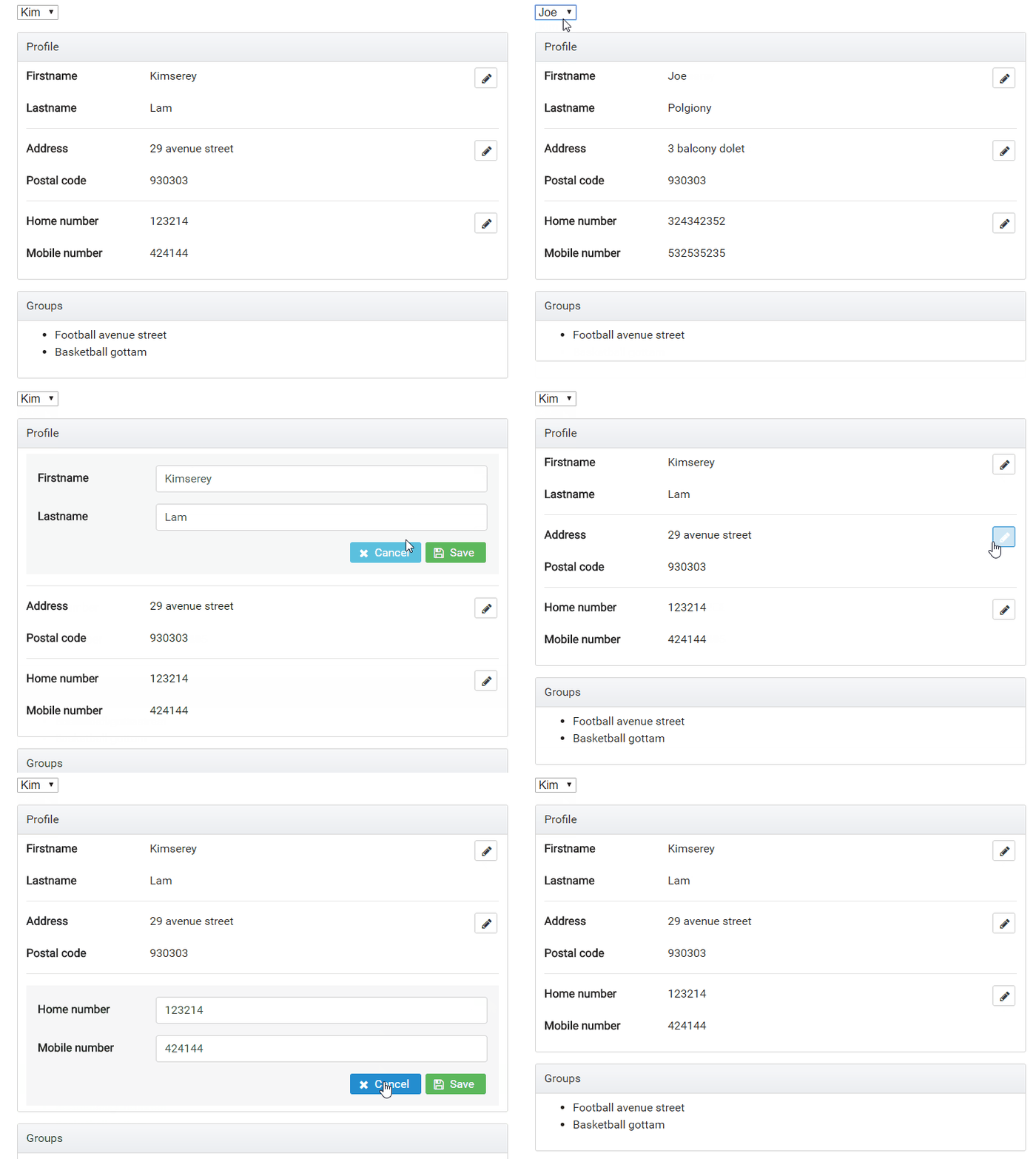
This is a preview of what we will be building:

preview

The full source code is available on my GitHub.

1. Build a diplay of segmented forms data

For the form we will be using Bootstrap, PrimeNg and FontAwesome.
Bootstrap provides universally known css classes. PrimeNg provides components for Angular like button, accordions, panels or datatables. In this example we will be using it to use a button with icon. FontAwesome is a dependency of PrimeNg used for icons.

In most cases, we have a group of properties constituting an object. Let’s take for exampple a User profile which contains the following properties:

  • Firstname
  • Lastname
  • Address
  • Postal code
  • Home number
  • Mobile number

In order to provide the best user experience for our users, we will implement an inline form. We start first by defining groups of properties which make sense to be changed together, for example firstname/lastname would be together, address/postal code would be together and finally the numbers would be together.
We then build the form and add a clear separation between the groups with <hr/>.
The separation also allow us to add a floating right edit button beside each section without making the display too cluttered.

<button pButton type="button" icon="fa-pencil" class="ui-button-secondary" (click)="toggleEdit('name')"></button>

We end up with the following html:

<p-panel header="Profile">
    <div class="row mb-3">
        <div class="col-sm-3"><strong>Firstname</strong></div>
        <div class="col-sm-7">{{ profile.firstname }}</div>
        <div class="col-sm-2 text-right">
            <button pButton type="button" icon="fa-pencil" class="ui-button-secondary" (click)="toggleEdit('name')"></button>
        </div>
    </div>
    <div class="row mb-3">
        <div class="col-sm-3"><strong>Lastname</strong></div>
        <div class="col-sm-9">{{ profile.lastname }}</div>
    </div>
    <hr/>

    <div class="row mb-3">
        <div class="col-sm-3"><strong>Address</strong></div>
        <div class="col-sm-7">{{ profile.address }}</div>
        <div class="col-sm-2 text-right">
            <button pButton type="button" icon="fa-pencil" class="ui-button-secondary" (click)="toggleEdit('address')"></button>
        </div>
    </div>
    <div class="row mb-3">
        <div class="col-sm-3"><strong>Postal code</strong></div>
        <div class="col-sm-9">{{ profile.postalcode }}</div>
    </div>
    <hr/>

    <div class="row mb-3">
        <div class="col-sm-3"><strong>Home number</strong></div>
        <div class="col-sm-7">{{ profile.homeNumber }}</div>
        <div class="col-sm-2 text-right">
            <button pButton type="button" icon="fa-pencil" class="ui-button-secondary" (click)="toggleEdit('number')"></button>
        </div>
    </div>
    <div class="row mb-3">
        <div class="col-sm-3"><strong>Mobile number</strong></div>
        <div class="col-sm-9">{{ profile.mobileNumber }}</div>
    </div>
</p-panel>

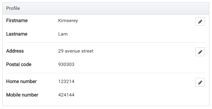
form

We have the data displayed and have the edit buttons but those don’t do anything yet.
Next we will be building the individual forms for each group of fields.

2. Build the segmented forms

As we can see from the picture we have 3 separated pieces which we can build form for.
In order to have a good way to find files, we can place the forms under a /profile folder under /components.

We have defined 3 groups; addressname and number.

/components
 - /profile
    - profile-address.ts (will contain the form for address)
    - profile-name.ts (will contain the form for name)
    - profile-number.ts (will contain the form for number)
    - profile.ts (will contain the display of the overall form)

To build the forms we will be using reactive forms. If you aren’t familiar with it, I suggest you take a look at one of my previous blog post on how to use Reactive form with Angular.

For the group name, we define two controls firstname and lastname and create two inputs under a group:

<form [formGroup]="form" (ngSubmit)="submit()" class="p-3 bg-faded">
  <div class="form-group row">
    <label for="firstname" class="col-sm-3 col-form-label"><strong>Firstname</strong></label>
    <div class="col-sm-9">
      <input id="firstname" type="text" class="form-control" formControlName="firstname" />
    </div>
  </div>
  <div class="form-group row">
    <label for="lastname" class="col-sm-3 col-form-label"><strong>Lastname</strong></label>
    <div class="col-sm-9">
      <input id="lastname" type="text" class="form-control" formControlName="lastname" />
    </div>
  </div>
  <div class="text-right">
    <button pButton type="button" class="ui-button-info" icon="fa-times" label="Cancel" (click)="cancel()"></button>
    <button pButton type="submit" class="ui-button-success" icon="fa-floppy-o" label="Save" [disabled]="!form.valid"></button>
  </div>
</form>

form_name

We use Bootstrap grid classes to inline the form, add padding with p-3 and apply a faded background with bg-faded.

Next we can build the component which backs the form HTML:

export class ProfileNameComponent implements OnInit {
  @Input() defaultFirstname: string;
  @Input() defaultLastname: string;
  @Output() submitForm = new EventEmitter<ProfileName>();
  @Output() cancelForm = new EventEmitter<void>();
  form: FormGroup;

  constructor(private fb: FormBuilder) { }

  ngOnInit() {
    this.form = this.fb.group({
      firstname: [this.defaultFirstname, Validators.required],
      lastname: [this.defaultLastname, Validators.required]
    });
  }

  submit() {
    this.submitForm.emit(this.form.value);
  }

  cancel() {
    this.cancelForm.emit();
  }
}

We initialize the form in ngOnInit with the default inputs.
We also define two function, submit and cancel which are used in the respective buttons.
We now have a working form component to change the firstname and lastname of the user. What is left to do is to display the form when in edit mode and display the data when in view mode.
View vs Edit mode will be decided by an editedField value which we will store in the state inside the ngrx store.

This component can pretty much be copied over for every forms.

For now let’s pretend that we have it and simply add the condition to show or hide the displayed data and form:

  <div *ngIf="editedField !== 'name'">
    <div class="row mb-3">
      <div class="col-sm-3"><strong>Firstname</strong></div>
      <div class="col-sm-7">{{ profile.firstname }}</div>
      <div class="col-sm-2 text-right">
        <button pButton type="button" icon="fa-pencil" class="ui-button-secondary" (click)="toggleEdit('name')"></button>
      </div>
    </div>
    <div class="row mb-3">
      <div class="col-sm-3"><strong>Lastname</strong></div>
      <div class="col-sm-9">{{ profile.lastname }}</div>
    </div>
  </div>
  <app-profile-name *ngIf="editedField === 'name'"
    [defaultFirstname]="profile.firstname"
    [defaultLastname]="profile.lastname"
    (submitForm)="submitName($event)"
    (cancelForm)="resetEdit()">
  </app-profile-name>

*ngIf="editedField !== 'name'" prevents the data from being shown we the group name is in edit mode while *ngIf="editedField === 'name'" shows the form in edit mode.
Now in order to have it hide and show the way the preview demonstrates, we will need to add editedField in to the state.

3. Bind the display edit buttons to the forms displays

This example start from the previous ngrx store guard tutorial, therefore the whole ngrx structure is already built. If you wish to know more you can check my previous post on ngrx store or Angular guard.

We start by adding the editedField to the State and the initialState.

// in reducers/user.ts

export interface State {
  ...
  editedField: string;
}

export const initialState: State = {
  ...
  editedField: null
};

Next we can define an action EDIT_FIELD which will be used to specify the state change.

// in actions/user.ts

export const EDIT_FIELD = '[User] Edit Field';

export class EditFieldAction implements Action {
  readonly type = EDIT_FIELD;

  constructor(public payload: string) { }
}

export type Actions
  = ...
  | EditFieldAction;

After that the reducer function can handle the edited field change:

export function reducer(state = initialState, action: user.Actions) {
  switch (action.type) {
    
    ...
    
    case user.EDIT_FIELD: {
      return Object.assign({}, state, {
        editedField: action.payload
      });
    }

    default: {
      return state;
    }
  }
}

Finally we can expose the selectors from reducers/user:

export const getEditedField = (state: State) => state.editedField;

Then the barrel reducers/index.ts:

export const getUserEditedField = createSelector(getUserState, fromUser.getEditedField);

After that we can extract the edited field inside the container which will use the profile container.

@Component({
  selector: 'app-user-profile',
  template: `
    <app-profile
      [profile]="profile$ | async"
      [editedField]="editedField$ | async"
      (changeEditedField)="changeEditedField($event)">
     </app-profile>
  `,
  styles: []
})
export class ProfileContainer implements OnInit {
  profile$: Observable<Profile>;
  editedField$: Observable<string>;

  constructor(private store: Store<fromRoot.State>) { }

  ngOnInit() {
    this.profile$ = this.store.select(fromRoot.getUserProfile);
    this.editedField$ = this.store.select(fromRoot.getUserEditedField);
  }

  changeEditedField(field) {
    this.store.dispatch(new user.EditFieldAction(field));
  }
}

We pass in the profile and edited field and handle the changeEditedField event.
Finally we complete the implementation by handling all form submit form the Profile component and emiting on changeEditedField for the container to catch up when edit is toggled.

@Component({
  selector: 'app-profile',
  templateUrl: 'profile.html',
  styles: []
})
export class ProfileComponent {
  @Input() profile: Profile;
  @Input() editedField: string;
  @Output() changeEditedField = new EventEmitter<string>();

  submitName(name: ProfileName) { }

  submitAddress(name: ProfileAddress) { }

  submitNumber(name: ProfileNumber) { }

  toggleEdit(field) {
    this.changeEditedField.emit(field);
  }

  resetEdit() {
    this.changeEditedField.emit(null);
  }
}

And that’s it, the same methodology can be followed to build the rest of the form. The full source code is available on my GitHub. https://github.com/Kimserey/ngrx-store-sample.

Conclusion

Today we saw how we could use ngrx store to maintain the state of an inline form edited field. Building inline form requires more work as multiple forms need to be built instead of a single big mess. Although more time is required to get it out, I highly believe that the improvement in user experience provided largely outweigh the time cost. Hope you enjoyed this post as much as I enjoyed writing it. If you have any questions, leave it here or hit me on Twitter @Kimserey_Lam. See you next time!

Free hosting web sites and features -2024

  Interesting  summary about hosting and their offers. I still host my web site https://talash.azurewebsites.net with zero cost on Azure as ...